

 Negative space can simply be defined as the space not used. Negative space enable us to create optical illusions, where we focus on one image, and only when we shift our perception to focus on the negative space, do we see another image as well. In above case, it's between a vase and two faces.
American Institute of Architects Center logo
I guess this company pretty much thought they're the key to the city or something like that. Notice the city in the logo?

Human logo
Subtle, eh? This logo takes us back to the start, the earliest stage of human being...got it? HUMAN is one of America's pre-eminent original music composition and sound design companies specializing in unique and compelling music for the international advertising industry.
Sinkit logo
Can you guess that this company has something to do with golf? Because this logo picture conveys the message perfectly.
Urban Chic
A comb and a city..how often you got that combination.
MyFonts logo
So, you notice the words, 'My Font' but do you notice the hand?
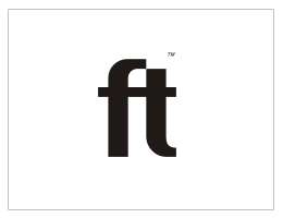
Fit logo
Do I need to explain to you how this logo fit perfectly with the word..I guess no.
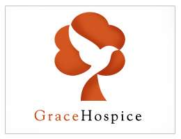
Grace Hospice
Let's play this game where you need to locate 3 objects in this logo..a tree, a bird and a red-head lady...in three seconds.
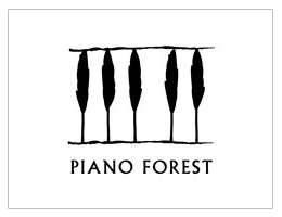
Piano Forest Logo
Once again, a brilliant combination of a piano and forest to reflect the name of the brand.
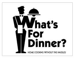
What’s For Dinner?
Aww, isn't that cute...how the letter W can create the illusion of a waiter.
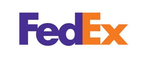
Fedex logo
Don't tell me you don't recognize this logo...but can you locate the hidden arrow in this logo? a lot of people miss it.
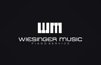
Wiesinger Music Logo
The letters W and M to represent the name and both letters are brilliantly designed to create the piano keys.
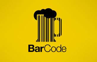
BarCode
Whoever relates the name of the brand and comes out with this logo is brilliant!
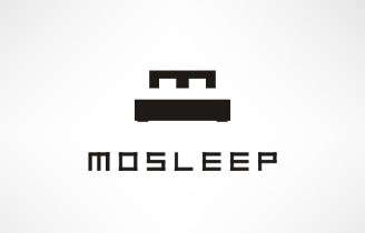
Mo Sleep Logo
Let me give you a hint. Find the letter M and a bed.
Iron Duck Clothing Logo
Nothing much to say. You can see the awesomeness yourself.
Maddoux
This idea is nicely done...albeit it's resemblance with the ying and yang symbol.
Unocu
Gotta be honest here, I don't know what's the word Onocu stands for...but this logo is cool if you can read the word reflect on it.
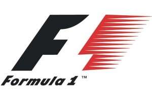
F1 Logo
See the use of negative space in this logo? And I believe the red area represents speed..
Invisible children Logo
If I got my geography correct, that's a shape of Africa masquerading as a foot print.
Toblerone Logo
Sure, we've all ate this Chocolate before, but have we ever notice the hidden bear in the logo and a small fish, if you look closely.
The Big Ten Logo
The Big Ten Conference is the United States' oldest Division I college athletic conference. Despite the conference's name, there are 11 schools in the Big Ten, as signified by the hidden "11" in the Big Ten Conference logo. So, one school decided to join the conference, why bother changing the name, right? Let's just reflect that in the logo.
Push the Bottle Logo
Image of a bottle and a finger pushing it..talk about brilliant!
Horror Films Logo
At first glance, you'll see a film reel, look again...I bet you'll see a ghost. Or maybe you see the ghost first. Now, what does that tell about you...

AntiSocial Network Logo
Yup, raise that middle-finger, you'll never fail to be anti-social. Nothing says anti-social perfectly..like this logo.
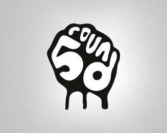
Round 5 Logo
The facts were this..you have five fingers, you have a brand called Round 5, let's translate that into something creative and cool.
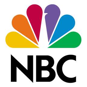
NBC Logo
Find the peacock, people...


22 comments:
Holy Shit, I never even noticed that FedEx arrow! I feel like I've been lied to my whole life
Cand find the red head old lady... :/
But nice logos anyway! :p
but, you claim these are the best design logos ever, yet you only specify the ones with hidden messages, why not actually put one that has no hidden message ant also has great design, like the Apple computers logo?
Because Apple is gay and so are you!
don't feel bad Sashi, i cant find the read head lady either
Omfg,I can't find the arrow!Can someone tell me where is it!?
The arrow...it's between the E and the x.
Good compilation of logo design.
Keep blogging.
Thanks...
yin and yang, not ying and yang
My Dad used to work for fed ex and I had never noticed the arrow before! Ha, ha. Love the use of negative space. You've inspired me in my own creative endeavours, thanks. :) To the couple of you who can not find the red head: it's a basic profile without a nose so it's not easy to see.... or maybe I'm wrong and I need to look again, lol. ciao! :)
I personally love the human logo along with FedEx. But some of this like the FT(fit) logo need a little something to make it more obvious.
In any case, I think that negative space is a great canvas for logos... it can help you communicate your message right from the start, while also giving you a creative chance at reducing the space you use.
i can find the lady, with red hair and white face, ofcz u dont notice bec there is no eye!... elegant logos lady-bird-tree
Hey Conrad. What does the Apple logo have that's so amazing? Apparently, the guy who invented the first PC died while eating an apple. Hence the bite taken out of the apple. If that's not a hidden message, I don't know what is.
Excellent post ! You make some brilliant points very nice realization. keep it up
Oh, I never noticed the Bear and Fish in the Toblerone logo. I always thought it was a large woman trying to catch a piece of toblerone in her mouth.
I love the NBC Logo Design, its really colorful.
Excellent post ! You make some brilliant points very nice realization. keep it up
All logos look so creative and brilliant i want to bookmark this page.
Hey, Really great work, I would like to join your blog anyway so please continue sharing with us,
I really enjoy reading your posts as I learn a lot from them. I also broaden my thinking as far as what I can use and do with things
Great Post, I’ll be definitely coming back to your site. Keep the nice work up.
wow it is beautiful this is a very nice blog thank you for sharing.
Ready-Made Logo
Post a Comment